Overview
Figma, Miro, Canva, Zoom
Challenge
Role
Time
Tools
This UX case study explores how to redesign the hotel booking flow based on usability testing and user research. The goal was to identify pain points in the booking journey and create a simplified, more transparent user flow that improves discovery, clarifies options, and streamlines checkout.
User testing revealed recurring frustrations across multiple booking sites:
🏖️ Difficulty finding hotels near desired locations
🍳 Unclear if breakfast was included in the price
🔁 Confusion around refundable or changeable rooms
💳 Checkout pages lacking a clear summary
🛏️ Room features and add-ons not visible enough
➡️ These insights highlighted the need for a clearer, more intuitive booking journey.
UX designer (solo): Notetaker, Moderator, Workshop facilitator, Information Architecture, Webdesign, with peer support for tests and card sorting
Sector
Hospitality – Hotel booking flow
12-month UX Design Institute program
Project:
Simplifying Hotel Booking Website
Design (Ideation & Wireframes)
Using insights from research, I started sketching and mapping user flows.
Methods:
Designed an intuitive booking flow with clear search fields, visible key information, streamlined forms, and optimized user paths based on research insights.
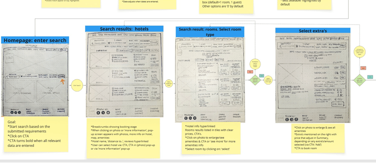
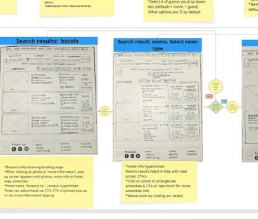
Proposed User Flow – Mapped the improved booking experience for better clarity and trust.
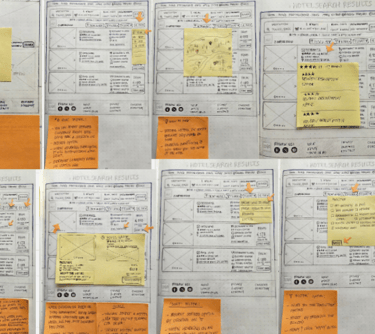
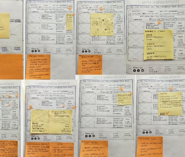
Low-Fidelity Wireframes – Sketched early concepts to explore structure and hierarchy.
Mid-Fidelity Wireframe – Explore layout, structure, content hierarchy, and user flow .
Outcome:
Search & Filters: Streamlined options to make location and preferences clearer
Pricing Clarity: Bundled “free breakfast” with price upfront
Checkout: Reduced from multiple unclear steps to 2 clear pages — one with personal details + booking summary, one with payment
Room Facilities & Add-ons: Made information visible at relevant points in the journey
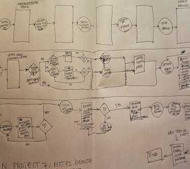
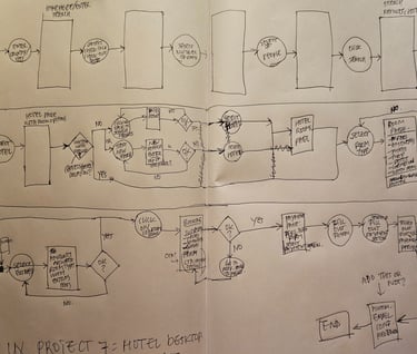
Flow diagram (sketch) → Mapped the redesigned booking journey step by step to define the ideal user path